My Role:
Art Director
Graphic Design
Brand Design
UX Design
Project Context:
Graduate school assignment to rebrand an existing product or brand
What I did:
Redesigned color and iconography
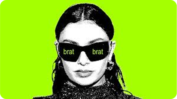
Created a new unique ad campaign
Completed and unified brand elements
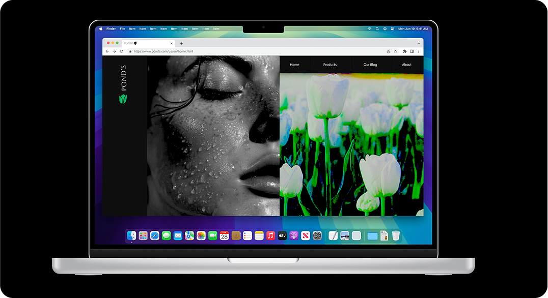
Revamped the brands homepage

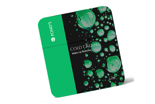
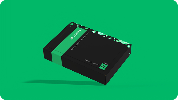
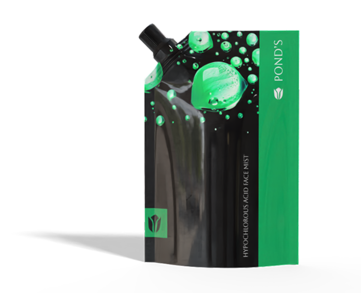
Not Your Grandma’s Skincare
When you look at the current branding of ponds you may see the skincare brand that your grandmother has been using her whole life or you may have never even heard of it. In this Case Study I attempted to reimagine this classic brand into a thing of the future with avant-garde choices and sexy branding, that brings in a young vibrant audience.


This project was a bit of a one man show, but I truly believe that this brand also shows my true design aesthetic because of this, I love applying controversial and even more sexual and provocative imagery to work and incorporating the taboos into the main stream which really appeals to a young fresh audience.


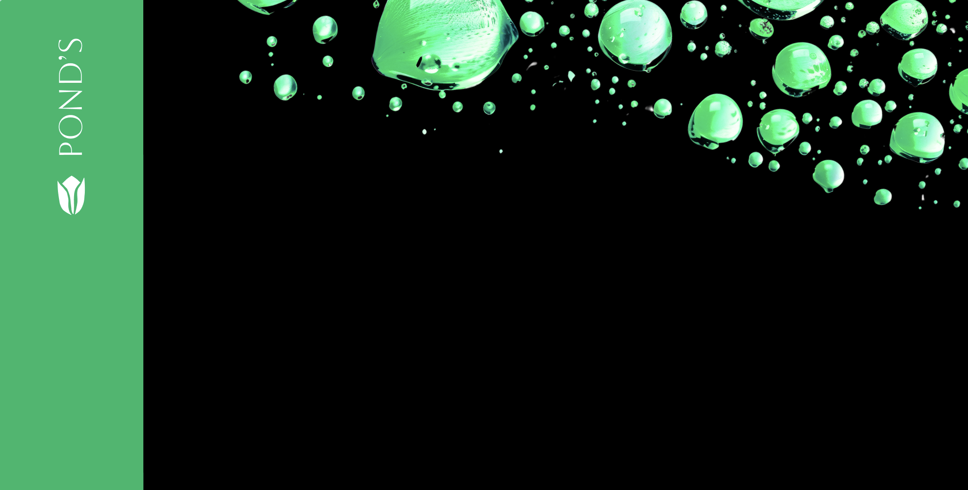
Get Wet
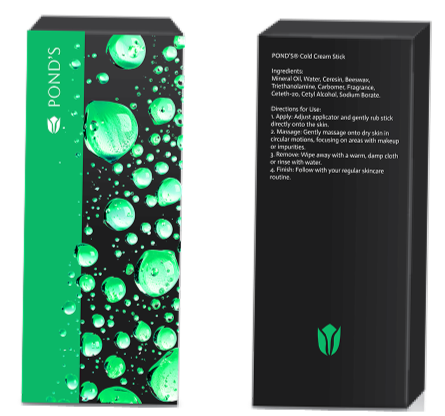
The brands tone was really core of this rebrand. A lot changed, but so much of that was necessary. The change brought the brand into present day by eliminating skin lightening products and creating a diverse landing space for women of all ages.

Research was done surrounding current trends in cultural contexts as well as within the BIPOC community to make the brand more inclusive and diverse. The idea was in a way to work it out in the remix by making reparations upping representation and bringing an iconic new flare to something in need of an update.
As a queer women I really was drawn to this idea of sensual skincare, mixed with the cliche of the skincare face splash, I wanted to make it something iconic powerful and a piece that puts the women in the drivers seat, of her skincare and vibe. According to Vogue Business, “78 per cent of advertisers and 31 per cent of agencies find it “difficult to adequately represent the LGBTQ community because it’s complicated and has many nuances”” This is something I wanted to change the idea that the landscape of this community being too complicated is one that is rooted in excuses

In the process of making this brand I found that the best way to connect with the brand itself was to connect with the audience so from connecting with my peers to talking to High School and Collegian students I was able to get a good grasp of the audiences preferences as I went through the process.
At its core, Ponds has stood for gentle, accessible skincare—and though that message seemed to have been worn out, this process allowed us to exfoliate the brand back into its prime.
Once the base brand was laid out I was able to truly create a world I was proud of within Ponds that was both inclusive and modern, appealing to all women and maybe thanks to our extra wet branding specifically lesbians.
The rebrand of Ponds is focused on bringing women an empowering chic product that is seductive fun and works. Rebrand specifically those with a focus on females who they are targeting
This rebrand of Ponds is focused on bringing women and empowering chic products that are seductive fun and works, hopefully mirroring the next standard of beauty products in a world were women's beauty is not measured by men.